Greenville Presbyterian Theological Seminary

Brand Refresh and Website Design and Development for Greenville Presbyterian Theological Seminary

2024
Brand Strategy
Branding
Website
Greenville Presbyterian Theological Seminary
01

OVERVIEW

Greenville Presbyterian Theological Seminary presented us with an important challenge: to revitalize their entire brand aesthetic, including the website. Given the seminary's established reputation within the Reformed tradition, our goal wasn’t to reinvent the brand but to refresh it—a lateral move, so to speak. We focused on reimagining existing elements while introducing complementary ones to enhance the overall look and feel. Additionally, we implemented a new typographic system to give the seminary greater flexibility.

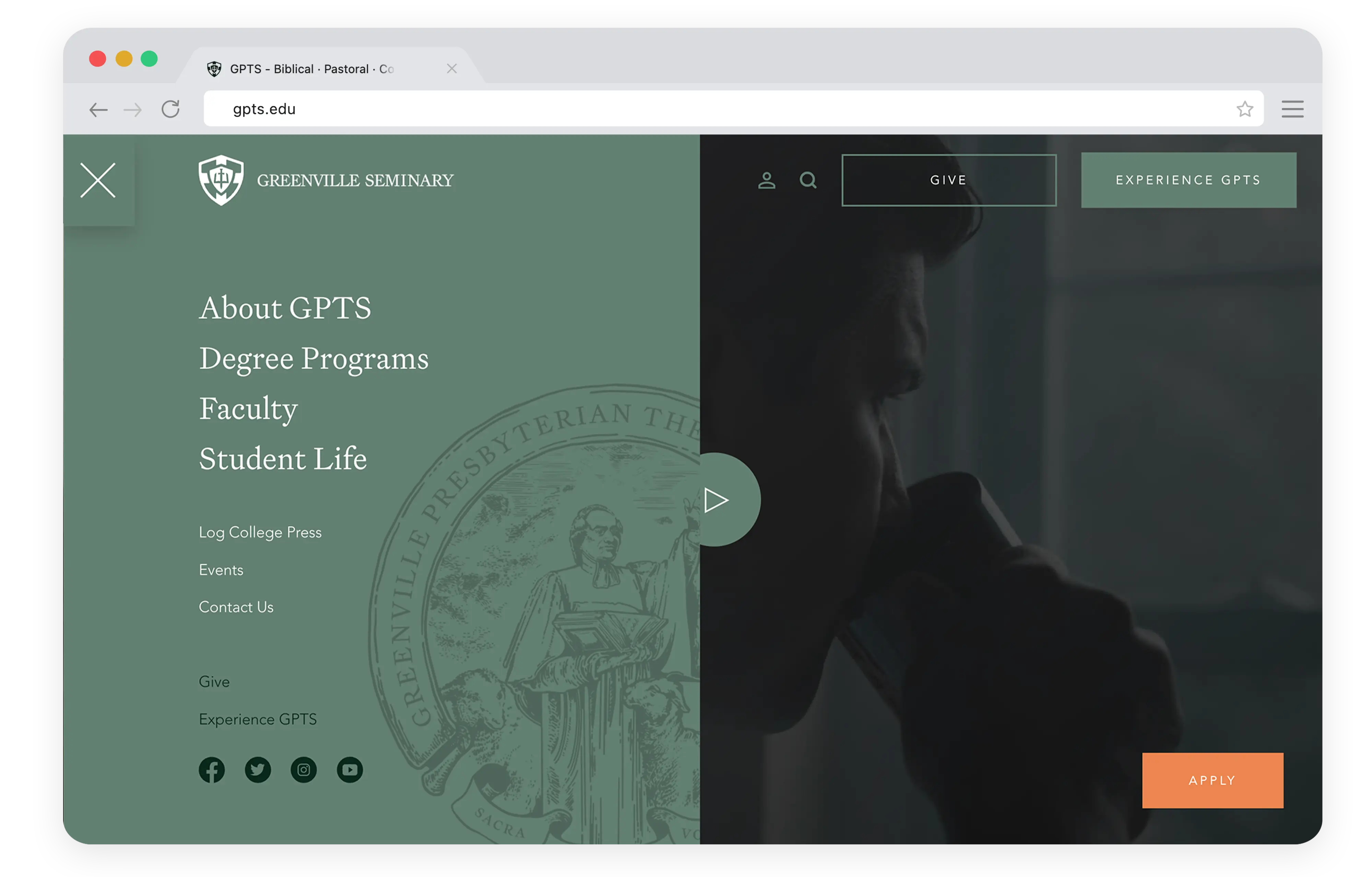
We were also tasked with creating a completely new digital experience—a website that would clearly convey the seminary’s mission of developing pastors both theologically and spiritually. It needed to strike a balance between elegance and modernity, offering users a seamless journey from an introduction to the seminary to an inspiring presentation of their compelling vision.


Side-by-side comparison of Greenville Presbyterian Theological Seminary's old and new logo designs

GPTS's previous logo was difficult to scale, creating challenges when adapting it to various platforms and aspect ratios. In addition, its outdated aesthetic gave it a stale, unappealing look. The inconsistent line widths also made the design visually jarring, making it harder to distinguish the individual elements.

GPTS's previous logo was difficult to scale, creating challenges when adapting it to various platforms and aspect ratios. In addition, its outdated aesthetic gave it a stale, unappealing look. The inconsistent line widths also made the design visually jarring, making it harder to distinguish the individual elements.

No items found.
Animated reveal of the new Greenville Presbyterian Theological Seminary logo on a white background

The new logo retains the elements of the old design but reimagines them in a way that allows for easy scalability while maintaining clarity, modernity, and elegance. The new typography is refined and elegant, yet has a distinctive style that gives the brand a unique and independent identity.

The new logo retains the elements of the old design but reimagines them in a way that allows for easy scalability while maintaining clarity, modernity, and elegance. The new typography is refined and elegant, yet has a distinctive style that gives the brand a unique and independent identity.

GPTS brand color palette shown alongside the redesigned seminary seal

Greenville Presbyterian Theological Seminary

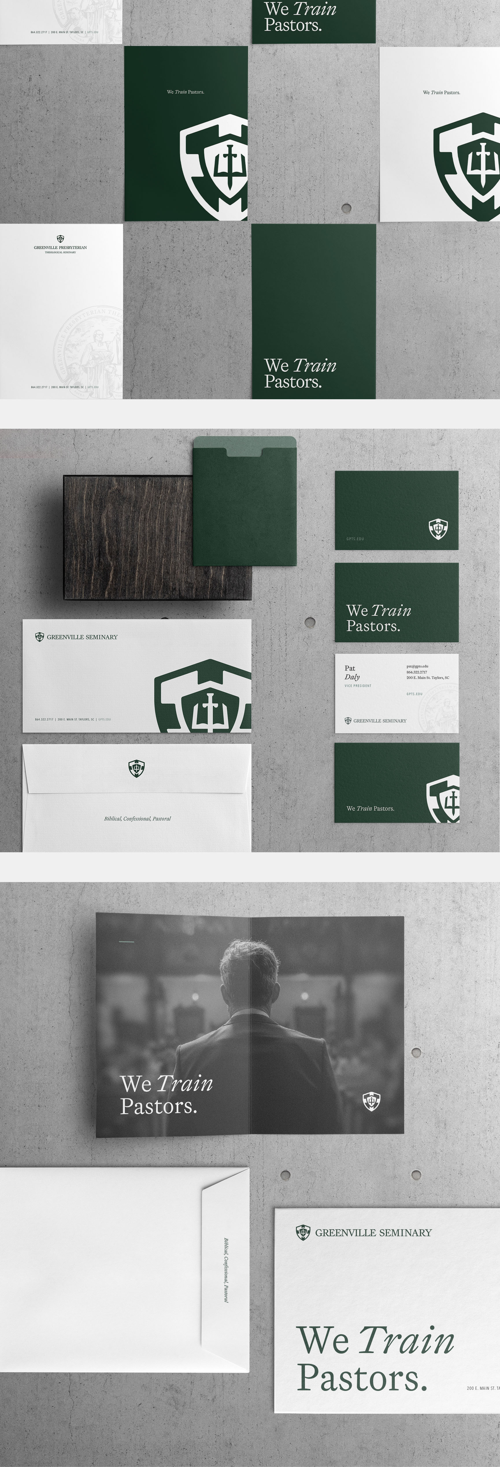
Additional GPTS stationery mockup showing envelope and notepad design

GPTS website homepage displayed on a mobile phone screen
GPTS Website
GPTS Website
GPTS Website
GPTS Website
GPTS Website
GPTS Website
GPTS Website
No items found.